Tableau Example 1:


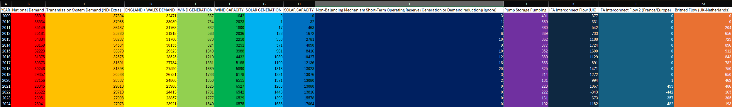
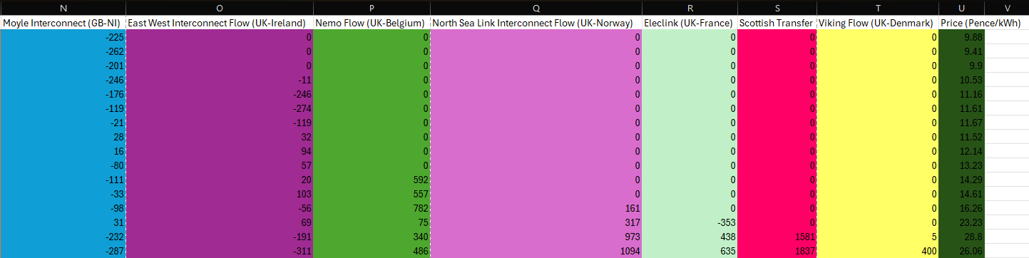
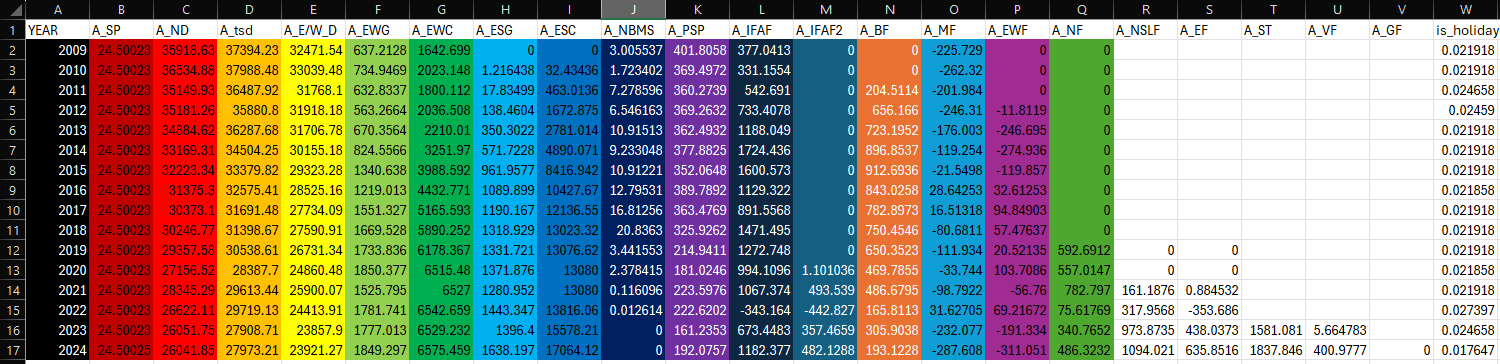
UK Energy Consumption 2009-2024:


Data Sources:

https://www.kaggle.com/datasets/albertovidalrod/electricity-consumption-uk-20092022?select=historic_demand_2009_2024.csv

https://www.data.gov.uk/dataset/93c3228c-0ad6-4e87-98c2-6a2b965d53b7/historical-electricity-data

Please Email me if you wish to download the Tableau Book File.


1. Downloaded the dataset from Kaggle.


2. Imported the dataset into Excel and cleaned the data by merging each day into the year by using the average

Excel Yearly Average


Using =AVERAGE(Column Value, Last Column Value) Example:(C:C) would give the average National Demand for 2009-2024.


3. I then refined the average data to be more understandable with importing into talbeau

Excel Yearly Average Clean Excel Yearly Average Clean


4. I Also found the price of electricity by downloading the price data from the UK Government website.


5. Since i now know both the Demand and Price of electricity, I could now compare them by year and visualise it in tableau


6. In Tableau, I imported the cleaned average data set which had all the information needed to create the dashboard above.


7. I made the tableau dashboard interactable by allowing the user to select the specific year which then filters by that year. (Unfortunately I can only export the project as a pdf/png)


8. From the data I have analysed, I can see that on average national demand has deceased since 2009 from 35K to 26K
While price per kWh has increased from ~10p in 2009 to ~26p in 2024 and Solar and Wind Generation has increased.
Aswell as the introduction of various European interconnections to the UK. (France, Netherlands, Denmark, Norway.)


Embedded Excel: